Handmade Digital
Like many firms, we have relied on physical scale models for most of our history to help us convey design concepts and tell three dimensional stories to perspective clients. But 3D modeling software was becoming a common tool of the trade, and in recent years, we have found ourselves pushed toward the use of digital models, and in doing so, we have wrestled with the pros and cons of this shift in technology - and how best to weave it into our design approach.
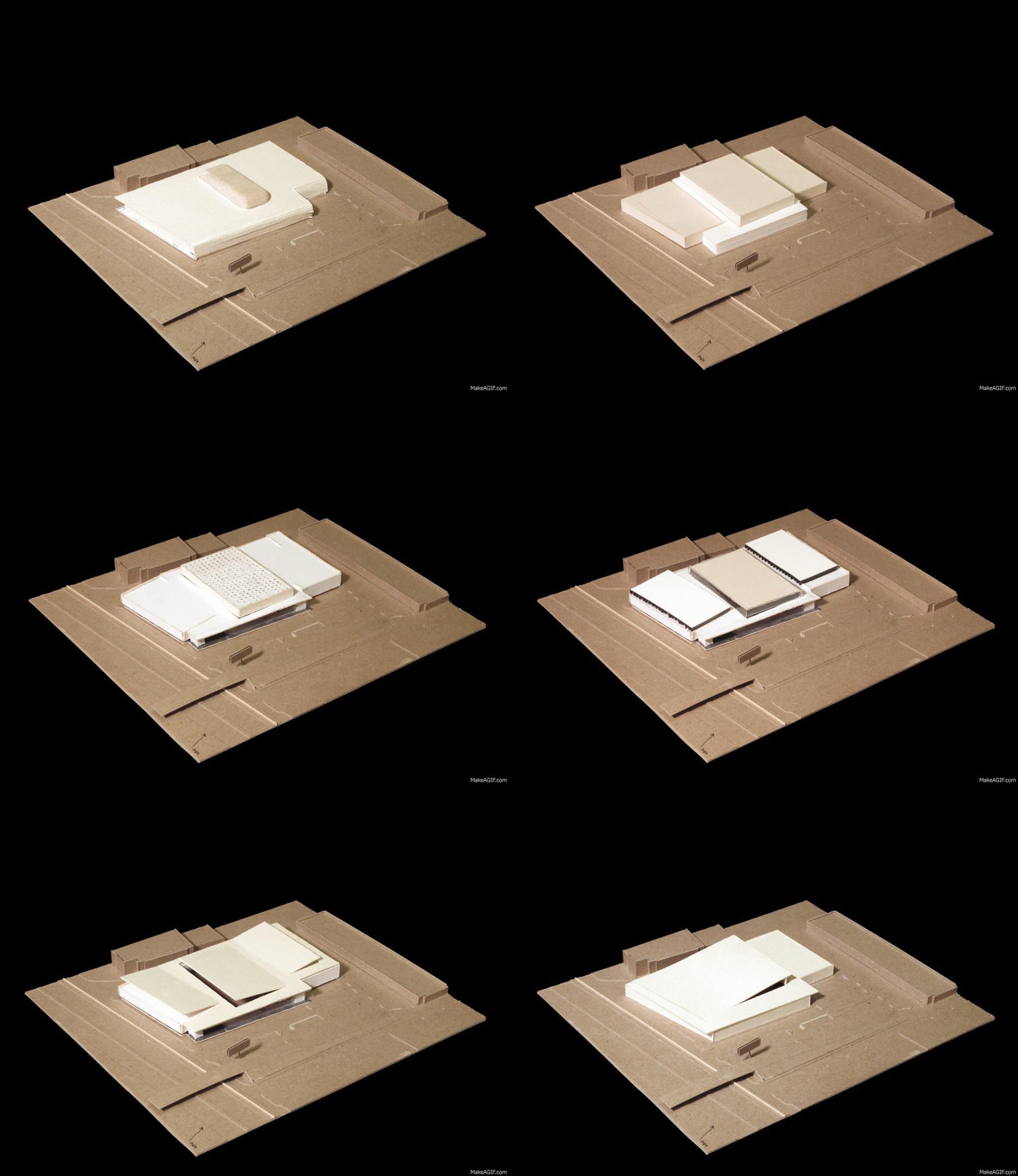
Digital modeling has some strong advantages. Modeling at a 1-to-1 scale allows the observer to more easily place themselves in the idea, as well as allowing for options and iterations to be much easier produce. A physical model can be labor intensive and, as a result, we often find ourselves stopping short of exploring every good option. Logistics of physical models were simply more difficult. Handling a fragile model when traveling to a design meeting or interview was always risky and was a source of countless horror stories. Thus, digital models started being a go-to technique in presenting to our clients.
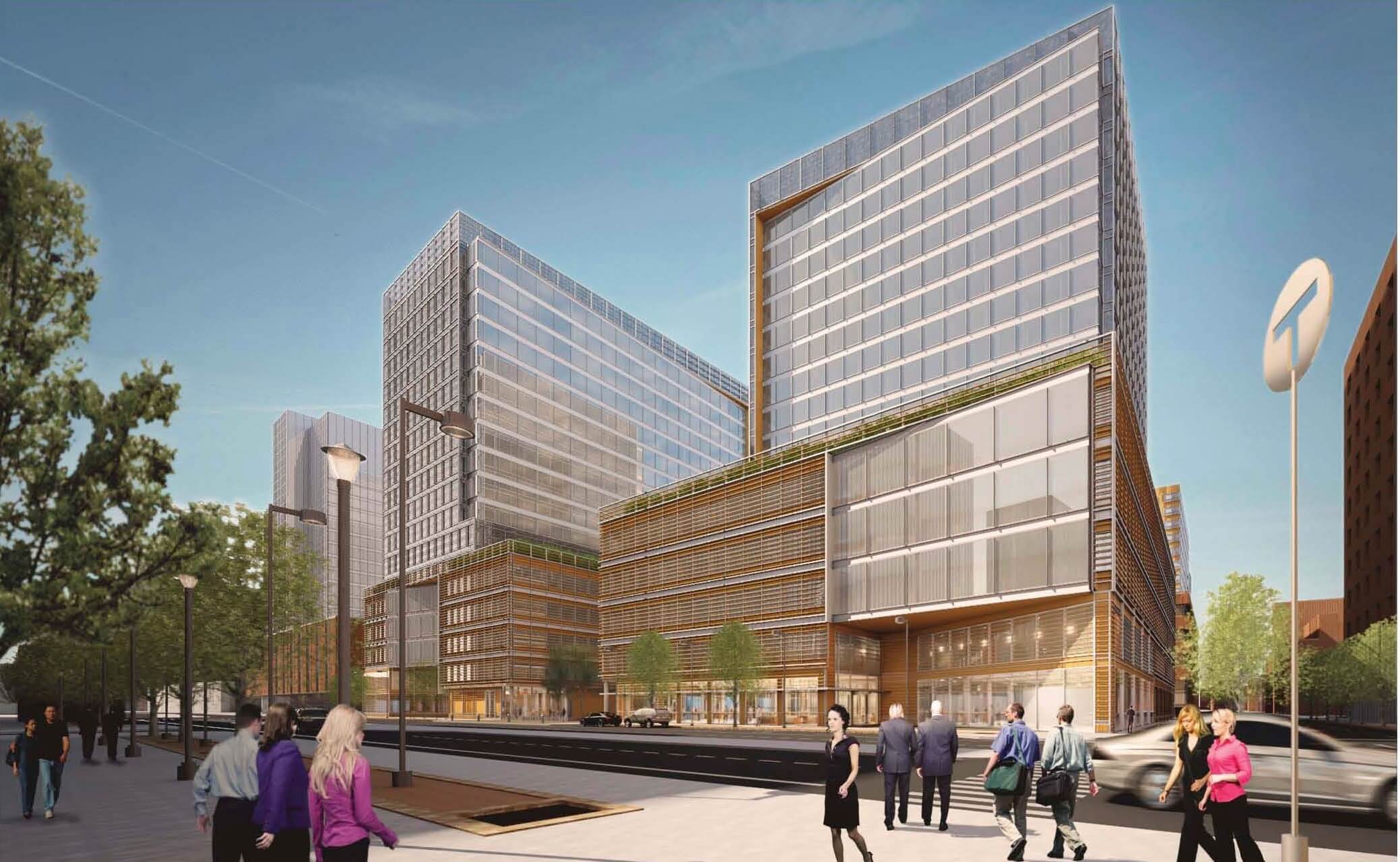
There are some downsides to digital models as well. The fact that you can experience a digital model as if you are occupying the space at full scale pushed many designers to feel like we had to figure out every detail, even before the first client meeting or interview. What were the wall is made out of? What is transparent is and what is solid? We found ourselves feeling pressured to show a door frame, a door, a door handle, and so on and so on. Should we develop one glorious scheme and put all our eggs into one basket to win a new project?
For us, the answer had to be no. At ARC, we do not believe a solution without context is any solution at all. A good solution needs deeply understanding the values of our clients. That exploration needs options, schemes, and iterations to discover. Presenting all the details of a space because the technology allowed for it, without any of the necessary exploration with our clients, did not feel like the right approach. A rethink of how we expressed ideas needed to immerge.
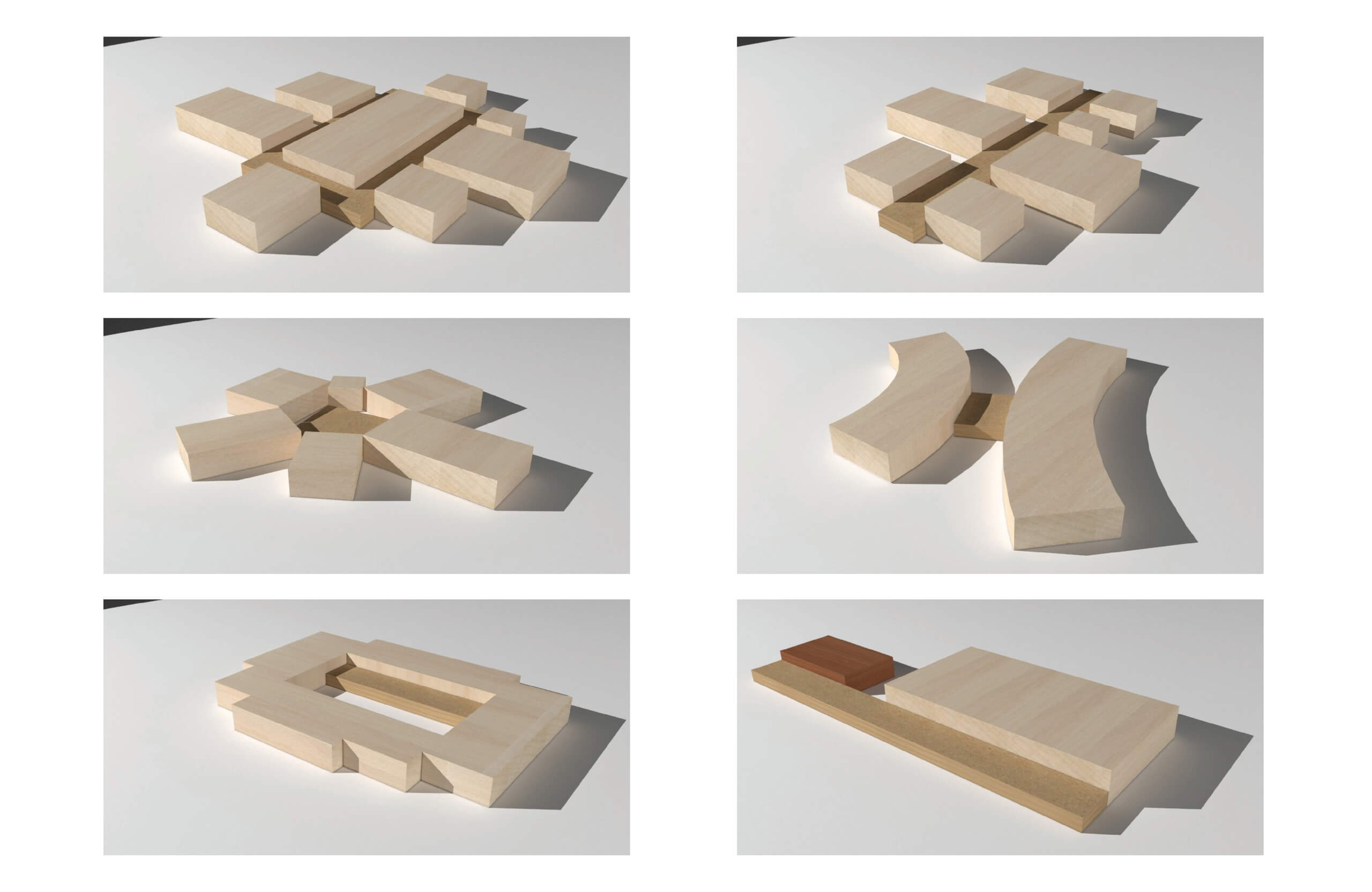
What came out of this exploration was a realization that when we were building quick study models by hand out of cardboard and wood, we were transmitting just enough information to get the ideas across, and that refining those models beyond that point was doing everyone a disservice. An idea immerged to use our digital modeling tools to be more honest about what we were trying to communicate just as we had in the past, so we decided to build these models in digital space using techniques developed based on our success building by hand.
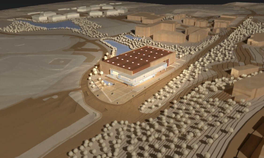
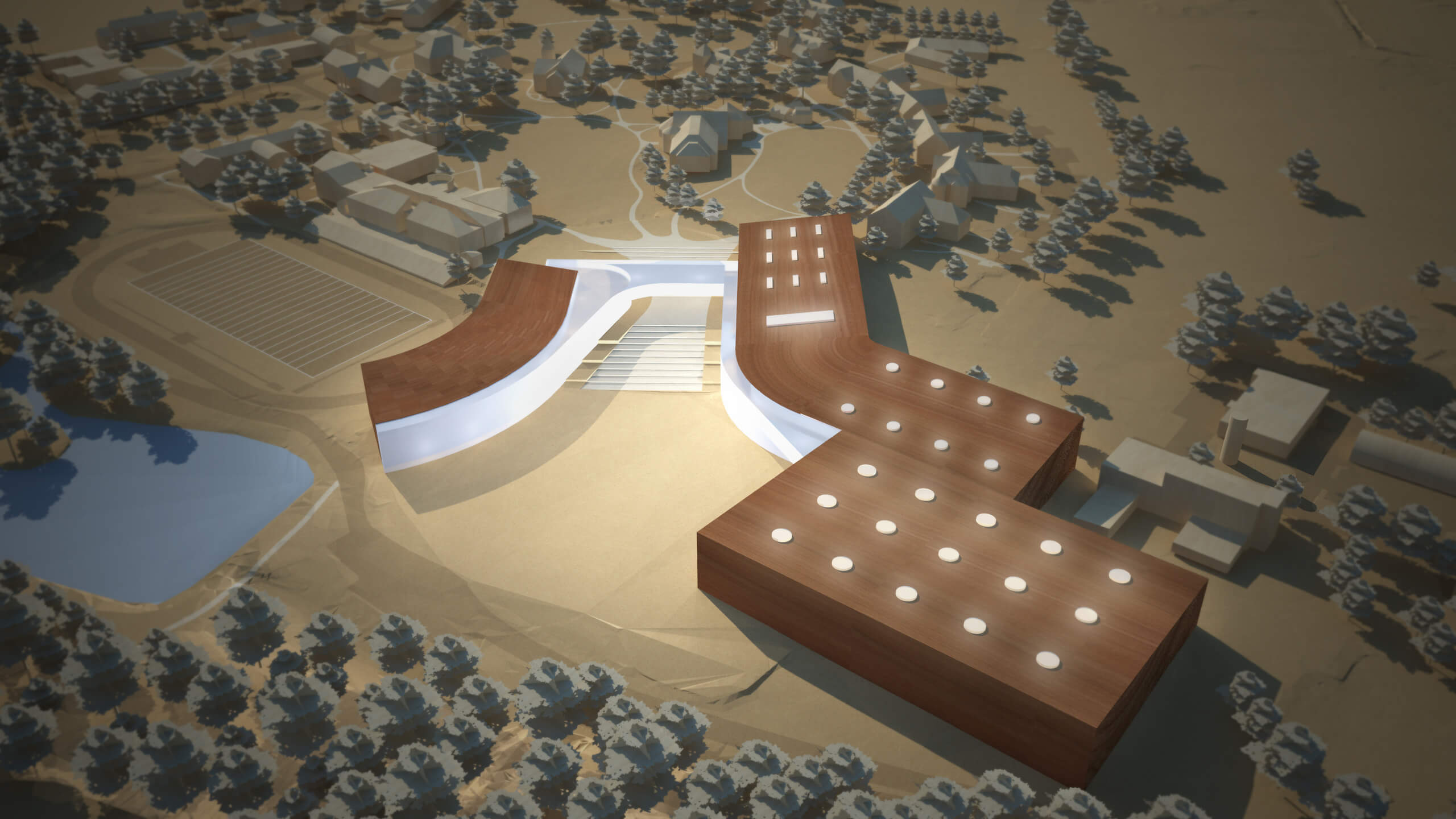
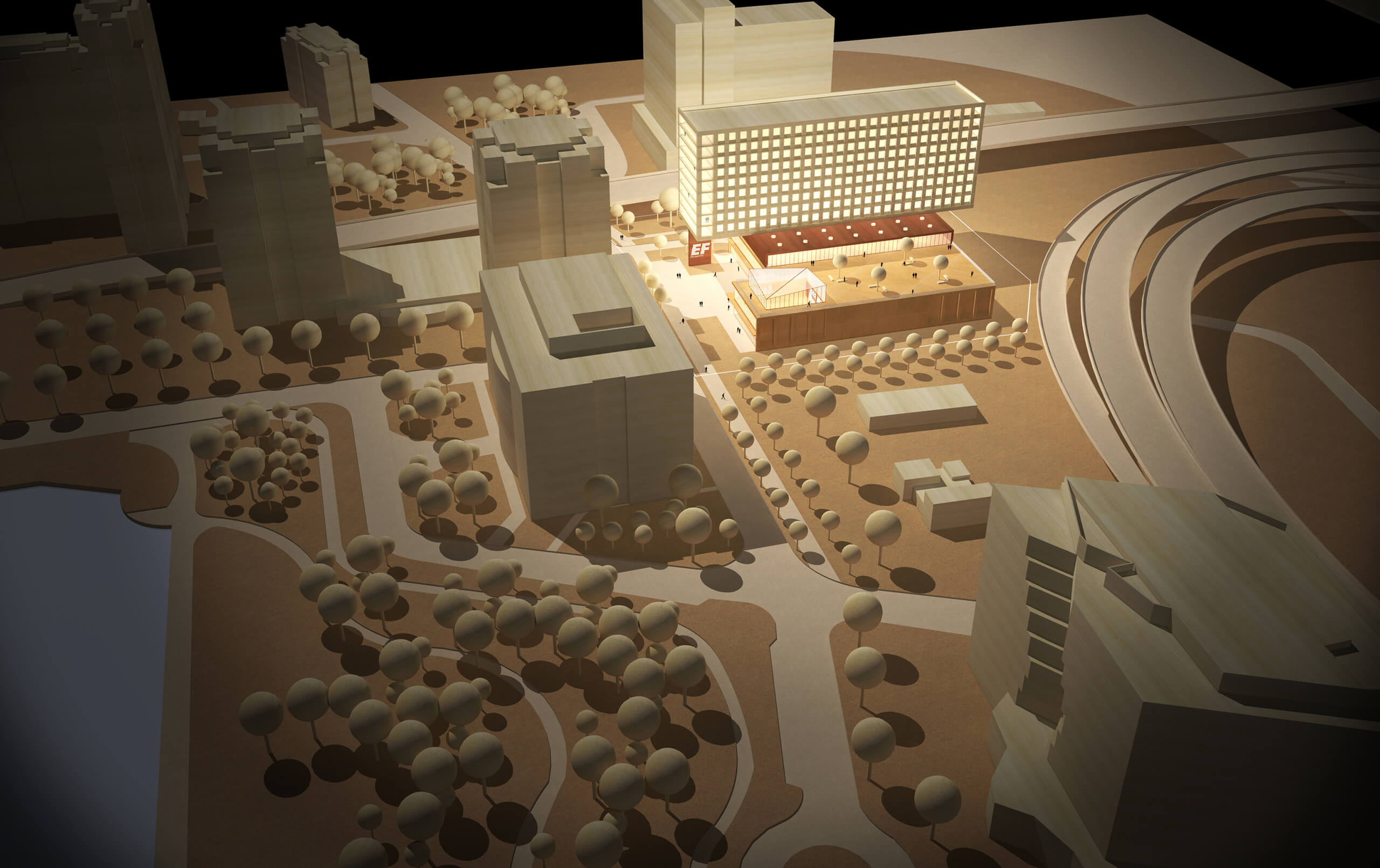
We took this idea to the extreme. We built the site as if we layered cardboard one on top of each other, we made the buildings out of “blocks of wood”, the windows were made to look like plexiglass, and we lit the models as if we took pictures of them in our office. We even used a technique called tilt-shifting to trick the eye into thinking that the model was built at a smaller scale. In the end, the digital models looked handmade, with all of their abstractions and imperfections included. The success of this process is not only that we can iterate quickly, or transport the models easily, but that the technique best expresses to a client, with whom we are just beginning to build a relationship, how we intend to work towards their goals and values. We don’t have the answers yet. How could we? But here is how we are going to explore the options together to assure your values are expressed in the end.